I downloaded the data from the New York Times for confirmed cases covid19 state data from March 1 thru March 26, 2020. Then I plotted this in Maxima.
(%i14) plot2d([discrete,NYlog],[title,"NY confirmed cases"],
              [xlabel,"March 2020 date"],[ylabel,"log souls"],
              [png_file,"nylog.png"])
(%o14)        [/home/nicks/maxout.gnuplot, /home/nicks/nylog.png]
(%o14)                            loveny.mac
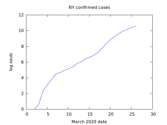
From eyeballing the graph, one can see that the doubling time has changed dramatically since about March 7, 2020. The curve has flattened. The doubling time before March 7, is about 3 days, while after it has settled to 11 to 12 days. That is significant progress.
There can be many reasons for this. First, I might have goofed in my plotting, or second, it maybe that there are less backlogs of tests being input, or third that social distancing has worked. Or it could be that it is a tough squiggly line to read.
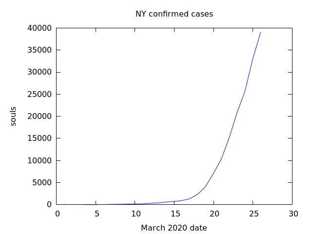
As a reference, consider a graph of the raw data.
(%i15) plot2d([discrete,NY],[title,"NY confirmed cases"],[xlabel,"March 2020 date"],[ylabel,"souls"],[png_file,"ny.png"]);
(%o15)         [/home/nicks/maxout.gnuplot, /home/nicks/ny.png]