The old joke is that George Washington slept in every bed in Pennsylvania. And it is true that if you visit every city, town, village, and hamlet — you will find a sign saying “George Washington slept here”. In fact, if you go to Cambridge Massachusetts and visit Longfellow’s house, […]
covid 19 select
The old adage “Little things mean a lot” is especially true when it comes to Covid. Out of necessity, I have been going to the local supermarket every week to get milk, steak, bread, salad, and potatoes. Since the first days of the pandemic in March (?), I have been […]
Two weeks before the election, a President accuses his sole adversary as running a “criminal enterprise”. To play the Devil’s advocate, let’s assume that he is right. The challenger is a criminal, and his family are criminals, and they have engaged in racketeering — i.e. conspiracy. Now we can’t trust […]
["2020-09-22",118273,1967], ["2020-09-23",119798,2029] What do these numbers mean? Today is September 24, 2020 and yesterday, the 23rd, 2029 people died from Covid-19 in the state of Missouri. And the day before on the 22nd, 1967 were dead. That means that 62 people died on the 23rd from Covid19. There were 118K […]
Listen to the political leaders here in the USA talk about wearing face masks to limit the spread and exposure to Covid-19. I don’t have any direct quotes, but actions speak louder than words. Holding a political rally, without practicing social distancing and mandatory mask wearing sets a bad example. […]
From what I’ve learned about this COVID-19 virus, is that (a.) It is not the Bogeyman and (b.) You MUST treat it with respect. What does this mean? It is important not to freeze up with fear, but it is critical that this is a public health emergency which demands […]
Today, April 24, 2020 I calculate a 16.1 doubling number for the State of Georgia. Given a total case count of 20,905 yields a 90 day estimate until there are a million cases of covid19. That would be July 23, 2020. If the spread of covid19 has not checked, then […]
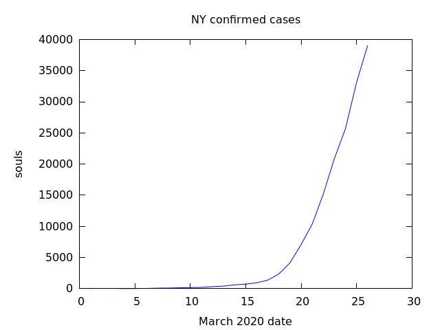
On March 21, 2020 I predicted 1 million cases by April 17 in New York State using a doubling number of 4 days. Doubling – flattening the curve – part 4 Thankfully, through the use of social distancing, sheltering in place, we were able to flatten the curve. I would […]
In November 1954, in Amazing Stories, Frank Herbert wrote a short story “The Gone Dogs” about a global pandemic that wiped out man’s best friend, all canines. As Science Fiction aficionados know well, Frank wrote the classic book “Dune”. It’s not the best short story that I have read, but […]
On March 6, I predicted that the worldwide total number of confirmed cases would reach 1 million by March 28. The prediction used a doubling number of four days. Today is April 2 and the total number of confirmed cases reached 1 million. So my prediction was off by five […]
In my post of Doubling Numbers – part 3 I predicted one million cases worldwide on March 28, 2020 — today. Well, I was wrong — there are 660,000 confirmed cases and 30K dead. That prediction was made on March 7, twenty one days ago when there were 21K cases. […]
I downloaded the data from the New York Times for confirmed cases covid19 state data from March 1 thru March 26, 2020. Then I plotted this in Maxima. (%i14) plot2d([discrete,NYlog],[title,"NY confirmed cases"], [xlabel,"March 2020 date"],[ylabel,"log souls"], [png_file,"nylog.png"]) (%o14) [/home/nicks/maxout.gnuplot, /home/nicks/nylog.png] (%o14) loveny.mac From eyeballing the graph, one can see that […]


